Improving in UX of the Cards Trip in the App
My Role
• The redesign and prototyping of cards
Results
• 23% drop in support tickets related to trip visibility and document uploads
• 73% of the drivers interviewed reported improved readability and ease of use.
• Reduction in operational errors
• Greater clarity regarding available actions
• The implementation time was reduced by the use of simpler, modular components.
• Rendering times on low-end devices saw an 18% improvement in performance.
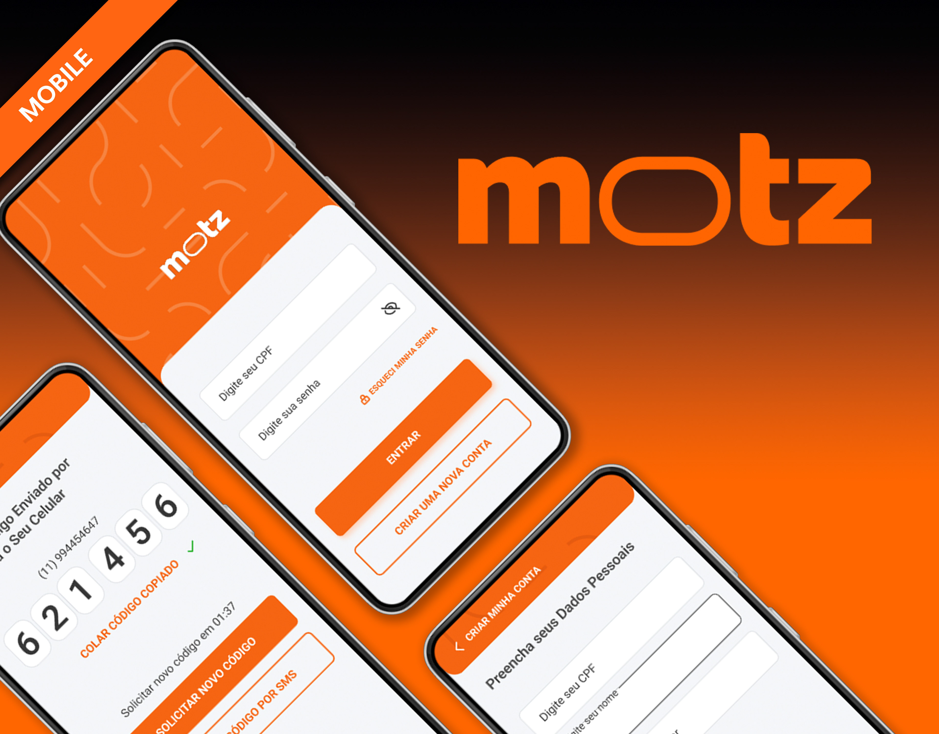
Intro
At Motz, our app is used by thousands of partner drivers to access, track and complete their trips.
The original screens for the truck driver's trip were developed by a different team at an earlier stage of the product's development. The current team was tasked with redesigning these interfaces in light of new insights, new requirements and a deeper understanding of how the product is actually used in practice.
User experience issues were revealed during daily use of the trip cards and trip details screen, which are two of the main touch points in drivers’ journeys through the app.
Project Overview
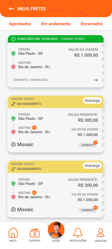
Trip Cards
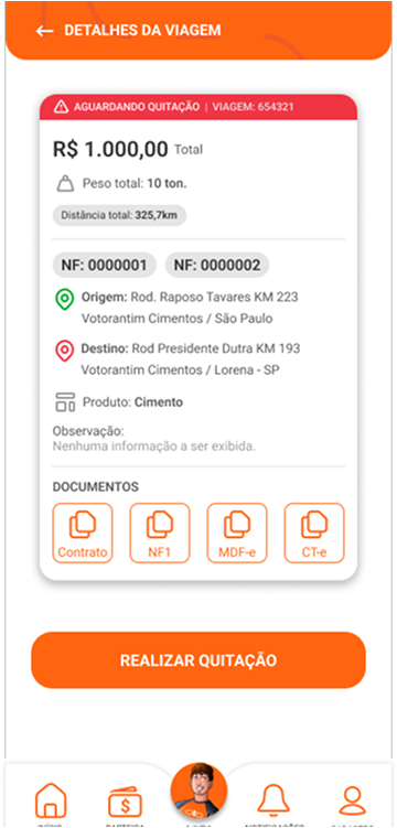
Trip details
The Trip Card and Trip Detail screens had become inconsistent and difficult to maintain. Originally developed by a different team, they no longer reflected the product’s objectives or users' needs.
The problems we identified were:
• Small font sizes made it difficult to read, especially for older drivers.
• Card design simulated paper tickets with cut-outs, which was difficult to implement and maintain.
• Important actions were hidden below the scroll line.
Colors didn’t follow intuitive status logic (e.g. green = completed).
• Interactive elements, such as downloadable documents, looked like plain text.
The result? Frustrated users, longer support sessions and an interface that didn’t scale.
Our redesign aimed to remove friction, improve performance and align the experience with drivers’ real-world contexts.
Key Questions That Guided Us
To avoid vague solutions, we used the 'How Might We' approach to encourage collaboration.
How might we enable drivers to recognise trip status instantly?
How might we reduce the number of taps required for critical actions such as uploading documents?
How might we build a UI that adapts to older phones but still feels modern?
How might we reduce the number of taps required for critical actions such as uploading documents?
How might we build a UI that adapts to older phones but still feels modern?
Strategic Design Decisions
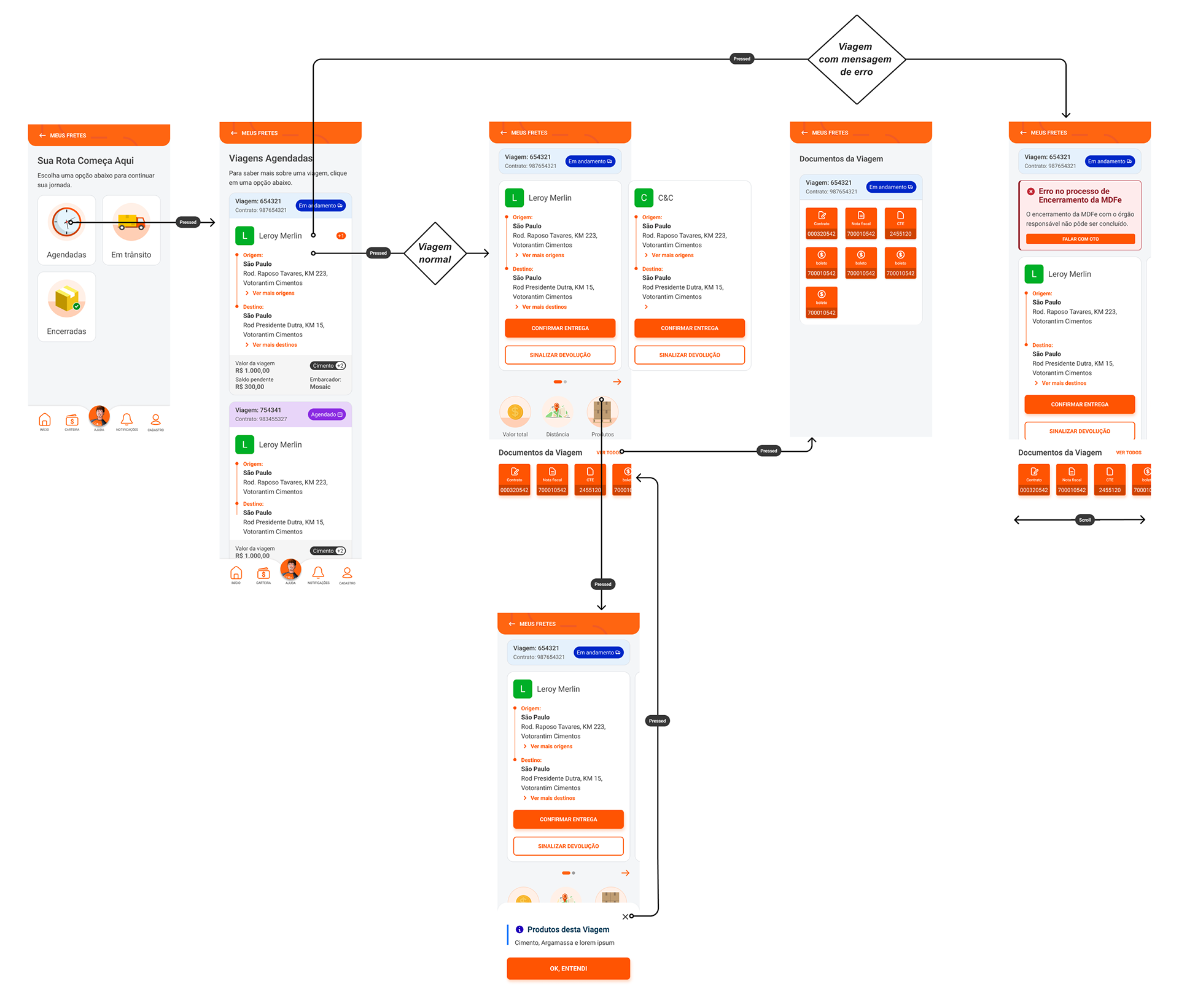
Restructuring navigation
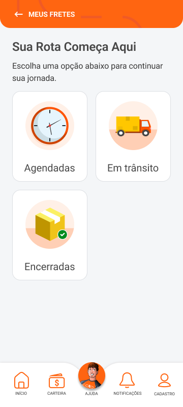
The first major change was to reconsider how drivers access the trip cards. Previously, navigation was done via a group of fixed buttons at the top of the screen ('Scheduled', 'In Progress' and 'Closed'). However, usability analyses and heat map data indicated that these buttons were difficult to reach.
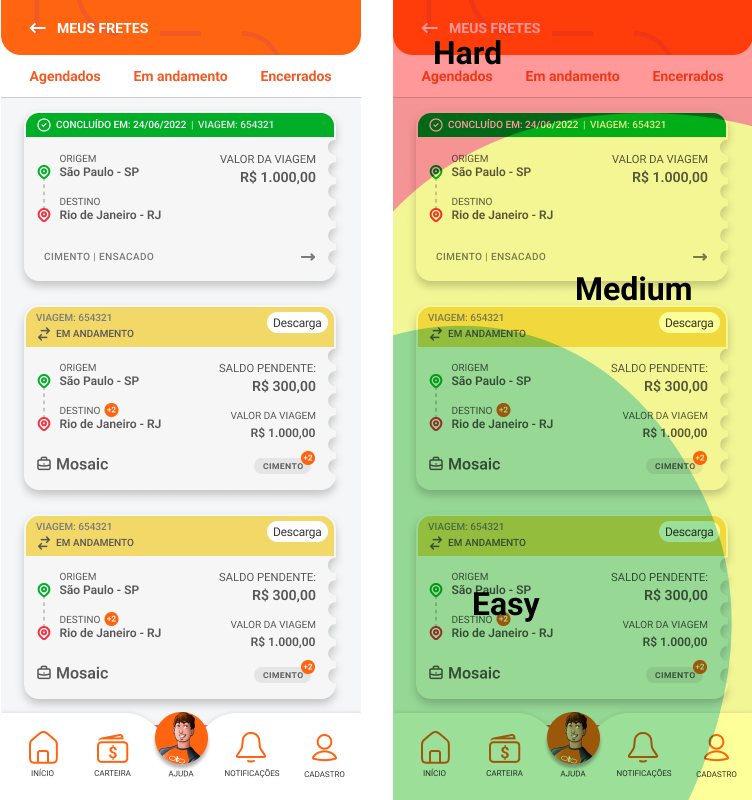
Before and with Heatmap applied
After
To address this issue, we replaced the buttons with a new screen containing cards representing the various stages of a trip: Scheduled, In Transit (the new name for 'In Progress') and Closed.
This redesign improved both discoverability and ergonomics.
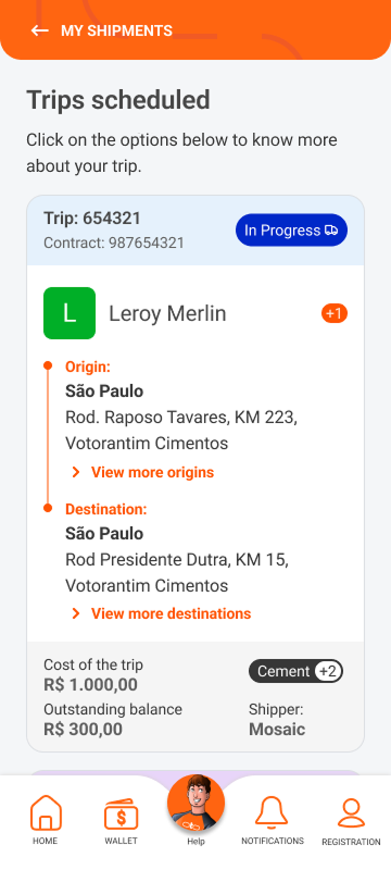
Typography and visual hierarchy
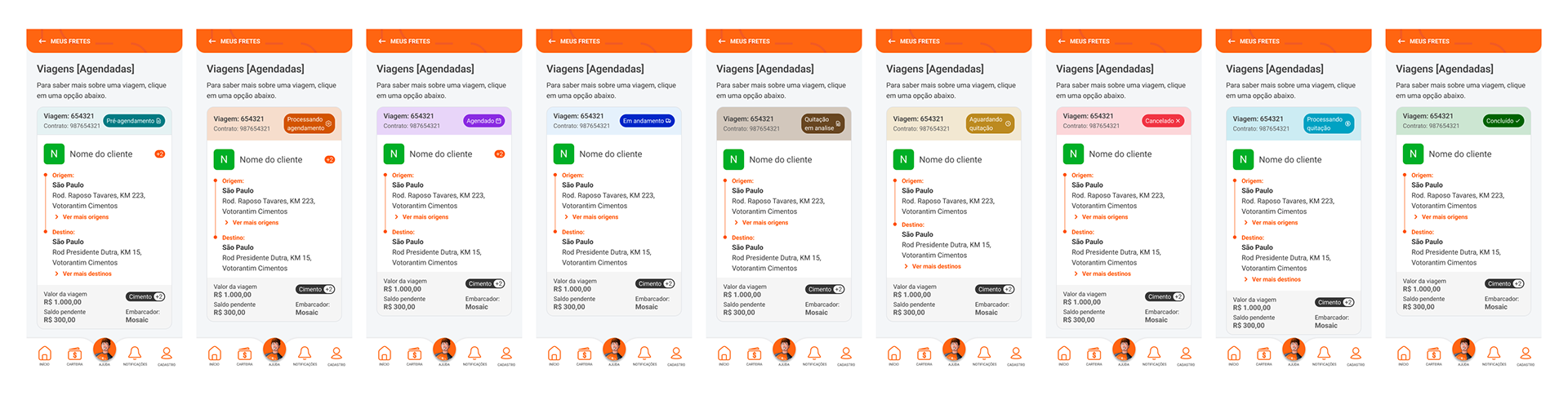

We increased the font size and applied high contrast between the text and the background. We also redefined typographic weights and the information hierarchy to highlight the information that is most important to the driver: trip status, origin/destination and available actions.
Drivers can now identify key information at a glance, even in bright sunlight.
Status Color Review
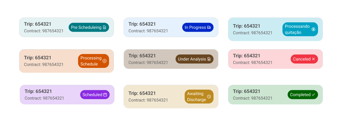
We reassessed the colors assigned to card statuses, aligning them with cognitive conventions recognized by our users. Green was adopted to indicate completed trips, while red was adopted to indicate cancelled trips, problems, and pending issues.
This resulted in misinterpretation being reduced and trust in the UI being increased.
Visual and technical simplification
We removed the ticket-shaped side cut-out, which simulated perforated paper, replacing it with a subtle, uniform outline that is simpler to render and maintain. We removed the shadows and complex visual effects in favor of a clearer and a higher-performance appearance.
The rendering time on entry-level Android phones has improved by 18%.
Components with better visual feedback
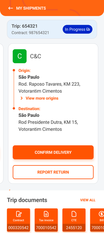
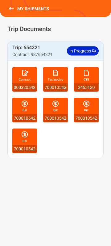
Clickable documents now resemble buttons in both appearance and behaviour. We added immediate visual feedback to touch and explanatory captions.
This resolved confusion. It also dropped support tickets about file download issues.
Repositioning of Key Elements
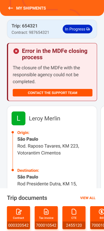
Error messages have been repositioned to remain visible when the screen is scrolled. Smaller screens have been given special treatment.
Responsive and modular design
We adopted a modular card approach with adequate padding and generous spacing to ensure elements work well on different screen sizes and aspect ratios.
Devices of a smaller size no longer had information such as error messages and action buttons hidden.
Impact
We didn’t just make things look better. We made them work better, too.
• Drivers completed actions such as document upload 18% faster, based on Dynatrace click flows.
• There was an increase in positive qualitative feedback. In interviews, 73% of drivers reported improved readability and ease of use.
• Support tickets related to trip visibility and navigation dropped by 23%.
• The front-end team reported spending 32% less time maintaining the trip card UI.
• There was an increase in positive qualitative feedback. In interviews, 73% of drivers reported improved readability and ease of use.
• Support tickets related to trip visibility and navigation dropped by 23%.
• The front-end team reported spending 32% less time maintaining the trip card UI.
We didn’t just make things look better. We made them work better, too.